

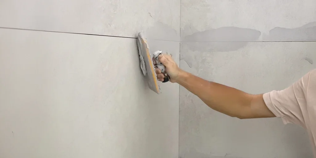
Tile grout suppliers UAE can help designers create more distinctive tiled surfaces by offering colours that complement different materials and interior styles. Grout is often treated as a finishing detail, but its shade can influence how tiles look once they are installed. A carefully chosen colour can highlight a pattern, soften the overall appearance or connect the tiles with other finishes in the room.
The best combination depends on the tile’s colour, texture and arrangement. Matching shades create a more continuous surface, while contrasting colours bring attention to individual tiles. Understanding these differences helps designers make colour choices that support the intended look of a space.
How Can Grout Colour Change a Tile Layout?
Grout colour affects the visual separation between individual tiles. A close colour match creates a subtle finish, whereas a darker or lighter joint makes the tile shapes more noticeable. Neither approach is automatically better; the choice depends on whether the design calls for a continuous surface or a more defined pattern.
The tile grout manufacturer in UAE can help designers explore different shades for their projects. Comparing grout samples with the selected tiles provides a clearer idea of how the finished combination will look.
Creating a subtle, coordinated finish
Tonal combinations work particularly well when the aim is to maintain a calm appearance. Beige tiles paired with sand-coloured grout, for example, can create gentle definition without drawing attention away from the surface.
This approach suits stone-effect tiles and interiors built around neutral colours. It allows natural-looking textures and variations to remain visible without introducing a strong grid between the tiles.
Introducing contrast through colour
Contrasting grout can make a straightforward tile arrangement more distinctive. Dark joints against pale rectangular tiles can emphasise a running-bond pattern, while a lighter shade against darker tiles can highlight their individual shapes.
The surrounding finishes should guide this decision. When tiles already have prominent patterns or markings, a softer grout colour can help keep the overall design balanced.
How Can Different Colour Families Complement Modern Tiles?
Grout colours should work with the wider interior palette rather than being selected in isolation. Cabinetry, flooring, worktops and decorative finishes can all provide useful references when deciding which shade will suit a tiled surface.
Tile grout manufacturers may offer options ranging from white and grey to beige, taupe and earthy tones. These choices allow designers to coordinate grout with different materials while maintaining the intended character of the room.
Working with warm neutrals
Cream, sand, taupe and soft brown shades pair well with many ceramic and stone-effect tiles. They can also complement timber finishes, warm flooring and natural textures without creating a competing focal point.
They are especially effective in spaces where modern furnishings and earthy elements come together. Choosing colours with matching undertones helps the finishes complement one another naturally.
Adding depth with earthy colours
Terracotta, muted olive and clay-inspired shades offer a more expressive alternative to conventional neutrals. They can complement handmade-effect tiles, textured surfaces and interiors featuring wood or natural stone.
A tile grout supplier UAE can help narrow down suitable colour options, but the final decision should be based on the actual materials. A shade that appears balanced on a colour chart may look quite different beside a glossy or textured tile.
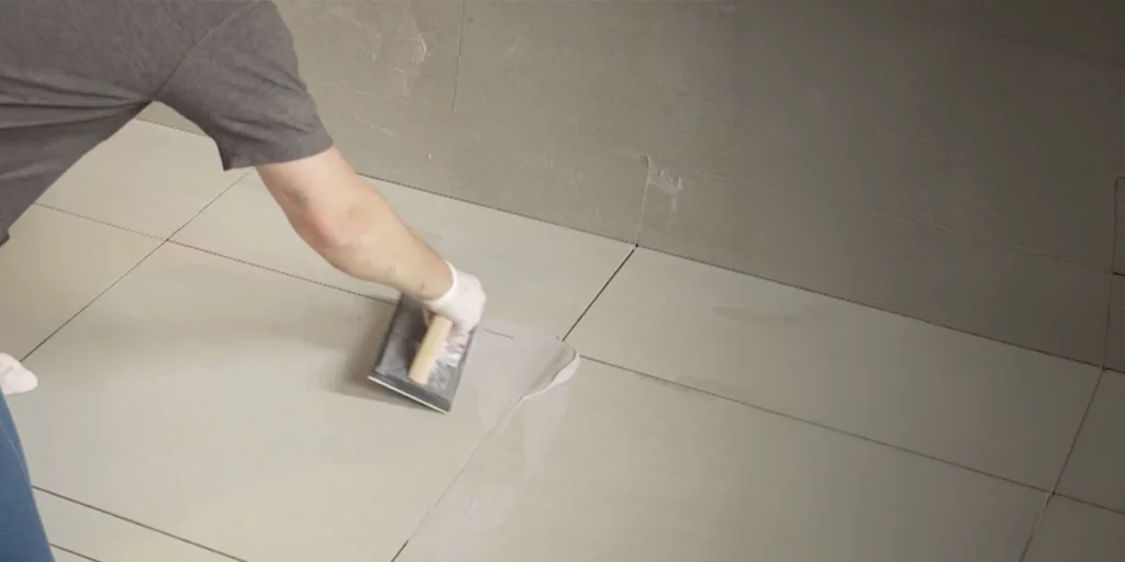
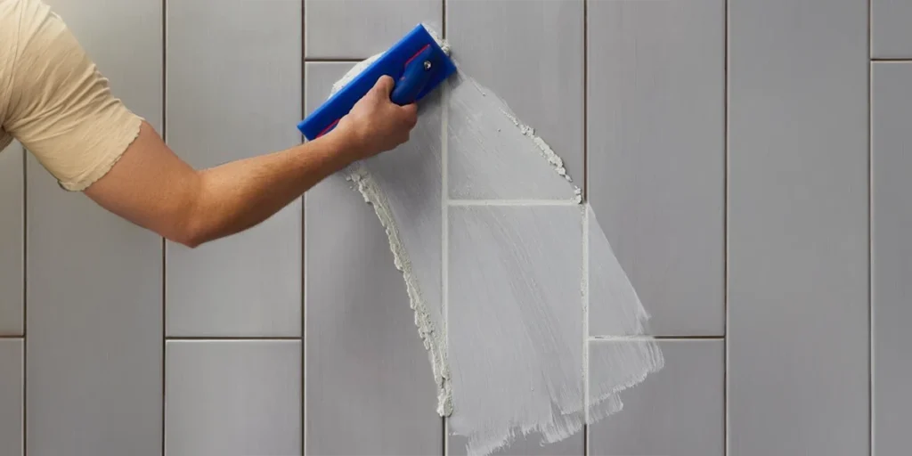
How Can Grout Colour Highlight Tile Shapes and Patterns?
Tile shape and layout influence how grout contributes to the finished design. Herringbone, chevron and geometric arrangements create distinctive visual effects, making grout colour an important consideration when defining the pattern.
Choosing grout for different tile sizes
Large-format tiles have fewer visible joints, while smaller tiles create more detailed patterns across a surface. With ceramic tile grout, the shade should complement the tile’s finish and texture, allowing the material to remain the main feature or giving the layout greater definition where needed.
Emphasising geometric designs
For herringbone or chevron layouts, grout can reinforce the direction of the tiles and make the pattern easier to recognise. A suitable shade helps the design stand out without overwhelming the surrounding finishes.
How Can Kitchen Tile Grout Complement Cabinetry and Worktops?
In kitchens, grout colour can help connect the backsplash with cabinetry and worktops. The aim is to create a coordinated palette that brings these materials together without making the space feel visually crowded.
Coordinating the backsplash palette
Kitchen tile grout can complement an existing colour in the kitchen, such as the undertone of timber cabinetry or the shade of a worktop. For example, a muted green backsplash paired with a soft grey-green grout can create a cohesive look that feels connected to the surrounding finishes.
Adding character to simple tiles
Grout can introduce detail to a plain backsplash without requiring additional decorative materials. A carefully chosen shade can give standard rectangular tiles a distinctive finish, particularly when the rest of the kitchen follows a simple design scheme.
Tile Grout Suppliers UAE: What Should Designers Check Before Finalising a Grout Colour?
Grout can appear warmer, cooler, lighter or darker depending on the lighting and the materials around it. Checking a sample under the intended lighting conditions is therefore more reliable than choosing a shade from a printed chart alone.
Interiors may receive strong natural daylight as well as warm or cool artificial lighting. Reviewing samples in these different conditions can help designers avoid unexpected changes in the appearance of the finished surface.
Testing samples in the actual space
Prepare a sample using the chosen tile and proposed grout colour. Place it beside nearby finishes to assess how the materials work together before approving the combination.
During the review, consider the following:
- Compare the grout directly with the actual tile.
- Check the sample under daylight and artificial lighting.
- View the combination from different distances.
- Place it beside cabinetry, flooring or other adjacent finishes.
- Assess whether the joint supports the design or distracts from it.
Considering joint width and surface texture
Grout colour is only one element that affects the overall look. Joint width, size of the tiles, and tile texture affect the amount of attention drawn to the joints.
The best tile grout is therefore the option that suits the intended design and meets the requirements of the application. Choosing a shade should involve both visual assessment and a review of the product’s technical specifications.
How Can Grout Selection Meet the Needs of Different Tiled Areas?
Different areas of a property have different practical requirements. The kitchen tile backsplash, the bathroom wall and the shower floor require different grouts based on their moisture content, cleaning needs and how they will be installed.
Waterproof tile grout may be suitable for certain moisture-exposed applications when the product is specifically designed for that purpose. However, grout alone does not replace the waterproofing system required in wet areas, so the manufacturer’s technical guidance should always be followed.
Checking product suitability
Before selecting a grout, consider where it will be installed and how the surface will be used. A product suitable for a decorative wall may not meet the requirements of a shower floor or another area exposed to frequent moisture.
Review the following details before making a decision:
- Compatibility with the tile material and joint dimensions.
- Suitability for the intended wall or floor application.
- Resistance requirements for the expected conditions.
- Installation, cleaning and maintenance instructions.
Coordinating Grout Colours Between Connected Rooms
When adjoining rooms have tiled surfaces, grout colours can help create a natural transition between them. For example, a light beige grout in a living area can pair well with a soft taupe shade in the adjoining kitchen, creating visual continuity without requiring the same colour throughout.
The key is to consider how the two tiled areas appear when viewed together. If one room features patterned tiles, a more understated grout colour in the neighbouring space can maintain balance, while a slightly deeper shade can help define a separate area. This approach keeps the rooms visually connected while allowing each space to retain its own character.
Conclusion
Tile grout suppliers UAE can support more creative tile designs by providing colour options that complement different materials, patterns and interior palettes. Tonal combinations create a subtle finish, while carefully selected contrasts can highlight geometric layouts and give simple tiles more character.
The best choice depends on the grout colour, tile size and joint width. Testing samples before installation helps ensure the final result meets both the design and practical requirements.
Snowden World offers tile finishing solutions for projects where material coordination and attention to detail are important to the overall design.
Frequently Asked Questions
Can grout colour change the appearance of a tile pattern?
Yes. Matching grout creates a seamless appearance, while contrasting colours make individual tiles and their patterns stand out. The effect is particularly clear with small tiles and geometric layouts.
Can warm grout colours work with cool-toned tiles?
Yes, because warm neutral shades can complement the cool toned tiles as long as their undertones are matched well. It is possible to find out through testing on a sample tile.
Should grout always match the tile colour?
No. Matching is one option, but a related shade or controlled contrast can produce a more distinctive finish. The decision should reflect the tile pattern, surrounding materials and intended visual effect.